The Photos on Your Menu Are Costing You Orders
A phone-camera method for restaurant food photography that works in a real kitchen, plus how to pick which dishes are actually worth shooting.
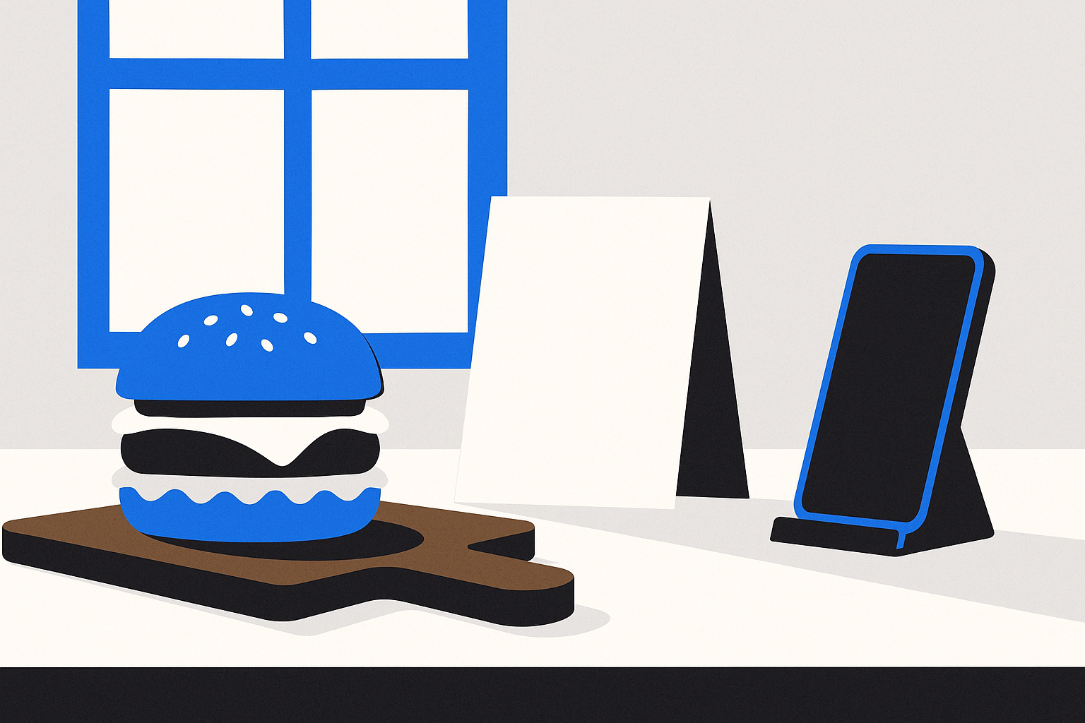
A photo taken under the heat lamp at 9pm on a Friday will cost you money. The light turns everything orange, the sauce has already started to set, there's a thumbprint on the rim, and the background is a stainless counter with a stack of takeout containers in the corner. Someone scrolling your ordering page sees that photo and quietly decides on the chicken instead.
Here is the thing most owners get backwards: a bad photo suppresses orders harder than no photo at all. An item with no picture is a blank the guest fills in with their own imagination, and their imagination is usually generous. An item with a bad picture has been answered for them, and the answer was "this looks worse than I hoped." You paid for that answer with two minutes and a phone camera.
The fix does not require a photographer, a light kit, or a day of shooting. It requires one window, one morning, and a decision about which five or six dishes are worth the trouble.
Stop trying to photograph the whole menu
Full-menu photo sets are where this project goes to die. Forty dishes means forty plates fired, forty plates wasted, and by dish twenty-two you are shooting under the hood light because you ran out of morning. The set ends up inconsistent, and inconsistency reads as sloppy even when individual shots are fine.
Shoot the dishes where a photo changes the decision. Three types qualify.
High-margin items people hesitate over. You know which ones. The item with good food cost that sells half as well as it should. The guest reads the name, reads the price, and moves on because nothing in the description tells them what they're getting. That hesitation is exactly what a photo removes. If you have not sorted your menu by margin lately, that exercise is worth doing first — how to price a menu when food costs keep moving walks through it.
Items with an unfamiliar name. Anything a first-time guest cannot picture from the words alone. Regional dishes, house specials, anything where the name is in another language or is your own invention. Those items live or die on the picture.
Anything where portion size is the real question. Platters, family packs, sharing boards, large combos. People do not order a $58 platter without knowing whether it feeds three or six. A photo with a normal dinner plate beside it answers that faster than a sentence can.
Skip the dishes that photograph badly and sell fine anyway. Brown stews, soups, dark curries, anything beige — a weak photo of those actively hurts. Let the description carry them.
The window-light method
One window, one table, one morning. Mid-morning is ideal: the light is bright but not direct, and your kitchen is calm.
Turn off the overhead lights. All of them. Kitchen fluorescents and warm pot lights fight with daylight and make the food look two different colours at once. Window only.
Put the dish beside the window, not facing it. Light coming from the side or slightly behind the plate shows texture — the crust, the char, the steam. Light from behind you flattens everything. If the shadow side looks too dark, prop a white sheet of paper, a menu card, or a cutting board covered in foil on the opposite side to bounce light back.
Clean the surface. A bare table, a sheet pan flipped upside down, a wooden board, or a single cloth napkin. No ticket rail, no squeeze bottles, no toaster in the background. One prop maximum — a fork, a glass, a small bowl of the dipping sauce.
Wipe the plate rim. Every time. Drips read as careless at full screen size even though nobody notices them at the table.
Shoot from the angle the guest sees. This is the single rule most people break. Sit down at a table, look at the plate, and notice where your eyes actually are. For a plated dish with height — a burger, a steak, a stacked sandwich — that's roughly a 45-degree angle. For anything flat or in a bowl — pizza, a poke bowl, a tray of dumplings, a salad — straight down from above. Shooting a bowl from the side gets you a photo of the side of a bowl.
Fill the frame and move your feet. Get the phone close instead of zooming. Zoom on a phone throws away detail. Tap the screen on the part of the dish you want sharp, then drag the little exposure slider down a touch — phones tend to overexpose food and blow out the highlights on sauce.
Shoot within ninety seconds of plating. Fried food goes limp. Cheese sets. Greens wilt. Have the dish plated fresh, carry it straight to the window, take eight or ten frames from slightly different heights, and move on. Three minutes a dish, six dishes, done before prep ends.
Editing: less than you think
Crop, straighten, nudge brightness up slightly, and stop. Phone photo apps all do this in under thirty seconds.
Skip the filters. Heavy saturation makes tomato sauce look radioactive, and warm filters make everything look like it was shot under a heat lamp — the exact problem you just spent a morning avoiding. The goal is "this looks like what arrives at the table," not "this looks like an ad."
Crop everything to the same shape. Square is the safest choice because it works on an ordering page, on Google, and on Instagram without being re-cropped. If every item photo on your menu is the same shape and the same distance from the food, the page looks professional even if no single photo is remarkable.
Where the photos actually go
Straight off the phone, each image is several megabytes, and twelve of them on one page will make your menu crawl on a phone over mobile data. Resize to roughly 1200 pixels on the long edge before uploading. That is plenty sharp and a fraction of the weight. We get into why this matters for orders in why your website should load before they change their mind.
Then put them to work in order of impact:
- Your own ordering page, on the items you chose. This is where a photo turns into a sale you keep the full margin on.
- Your Google Business Profile. Photos there show up next to your listing when someone searches your name or "restaurant near me."
- Delivery apps. Items with photos get chosen over items without, and the apps will happily let you upload your own rather than using whatever stock image they picked.
- Instagram and your email or SMS list, where they do double duty as content.
If your menu currently lives as a PDF, photos can't help you much — nobody pinches and zooms a PDF to look at food. That problem is worth solving first, and we covered it in a menu PDF is not an online ordering system. When we build ordering for restaurants, item photos are part of the setup, and we'd rather load six good ones than thirty mediocre ones.
Treat the photo as a promise
The photo sets the expectation the plate has to meet. If you shrink the portion, change the garnish, or switch suppliers and the dish now looks different, update the picture. A guest who orders the photo and receives something else does not complain — they just don't order it again, and sometimes they mention the gap in a review.
Put it on a schedule you can actually keep. Once a quarter, pick a quiet morning, pull the three items you want to sell more of this season, and shoot them by the window. Twenty minutes. That is the whole job.
The short version
- Shoot high-margin items people hesitate over, not the whole menu.
- Window light only, overheads off, light from the side.
- Clean surface, clean rim, one prop at most.
- Burgers and stacked plates at 45 degrees; bowls and flats from directly above.
- Fill the frame by moving closer, not zooming.
- Plate it and shoot it inside ninety seconds.
- Crop everything square, nudge brightness, no filters.
- Resize before uploading, then use the same shots on your menu, Google, and the apps.