In today’s mobile-first world, having a website that adapts seamlessly to any device isn’t just a luxury—it’s a necessity. Imagine a potential customer trying to access your site on their smartphone, only to be met with tiny text, unclickable buttons, and a frustrating user experience. Chances are, they’ll quickly leave and find a competitor with a more mobile-friendly presence. This is where the benefits of responsive web design come into play. It’s the key to providing a positive user experience across all devices, boosting your online visibility, and ultimately, driving success.
What is Responsive Web Design?
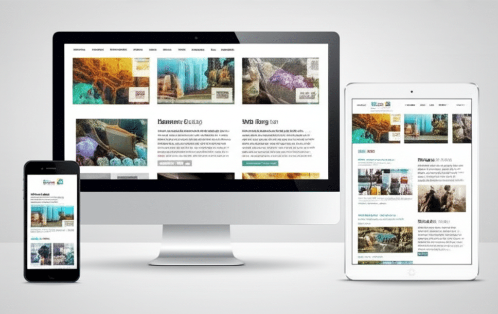
Responsive web design is a web development approach that creates dynamic changes to the appearance of a website, depending on the screen size and orientation of the device being used. Whether it’s a desktop computer, a tablet, or a smartphone, a responsively designed website automatically adjusts its layout, images, and content to provide an optimal viewing experience. This means no more zooming, pinching, or horizontal scrolling – just a seamless and enjoyable browsing experience for everyone.
Enhanced User Experience: A Core Benefit of Responsive Web Design
Improved Navigation and Readability
One of the most significant benefits of responsive web design is the dramatic improvement in user experience. Navigation becomes intuitive and effortless, with menus and buttons resizing and rearranging themselves for easy access on smaller screens. Text also adapts, eliminating the need for users to zoom in and out constantly. This enhanced readability makes it much easier for visitors to consume your content and engage with your website.
Reduced Bounce Rates and Increased Engagement
A frustrating user experience can lead to high bounce rates, meaning visitors leave your site quickly without exploring further. Responsive design combats this by providing a smooth, enjoyable browsing experience, encouraging users to stay longer, explore more pages, and ultimately, convert into customers. This increased engagement translates to more time spent on your site, higher conversion rates, and a stronger online presence.
Boosting Your SEO with Responsive Web Design
Improved Mobile SEO
Google and other search engines prioritize mobile-friendliness as a key ranking factor. Implementing responsive web design is a crucial step in optimizing your website for mobile search, improving your visibility in search results and attracting more organic traffic. By providing a seamless mobile experience, you signal to search engines that your website is user-friendly and deserves a higher ranking.
Consolidated Content and URLs
With responsive design, you only need to manage one website and one set of content, as opposed to separate mobile and desktop versions. This simplifies content management and avoids duplicate content issues that can negatively impact SEO. Having a single URL for all devices also strengthens your link equity and makes it easier for search engines to crawl and index your website.
Cost-Effectiveness and Easier Maintenance
Streamlined Website Management
Managing a single responsive website is significantly more efficient and cost-effective than maintaining separate versions for different devices. This streamlined approach simplifies updates, content management, and overall website maintenance, saving you time and resources. You can make changes once and they are automatically reflected across all devices.
Long-Term Cost Savings
While the initial investment in responsive web design might seem higher than creating a separate mobile site, the long-term cost savings are substantial. Eliminating the need for separate development and maintenance efforts translates to reduced expenses and a more sustainable web presence.
The Future is Mobile: Embracing Responsive Web Design
Staying Ahead of the Curve
Mobile usage continues to grow exponentially, making responsive web design no longer a trend but a fundamental requirement for online success. By embracing responsive design, you future-proof your website and ensure it remains accessible and user-friendly for years to come. This proactive approach keeps you ahead of the curve and positions your business for continued growth in the mobile-first era.
Conclusion: Reaping the Rewards of Responsive Web Design
The benefits of responsive web design are undeniable. From enhancing user experience and boosting SEO to simplifying website management and reducing costs, it’s a crucial investment for any business looking to thrive in today’s digital landscape. By embracing this approach, you not only provide a seamless browsing experience for your visitors but also position your website for long-term success. Are you ready to unlock the full potential of your online presence with responsive web design? Consider the points discussed above and take the necessary steps to optimize your website for the mobile-first world.